Monday 30 April 2012

Final posters


These are the final two posters I'm going to submit.

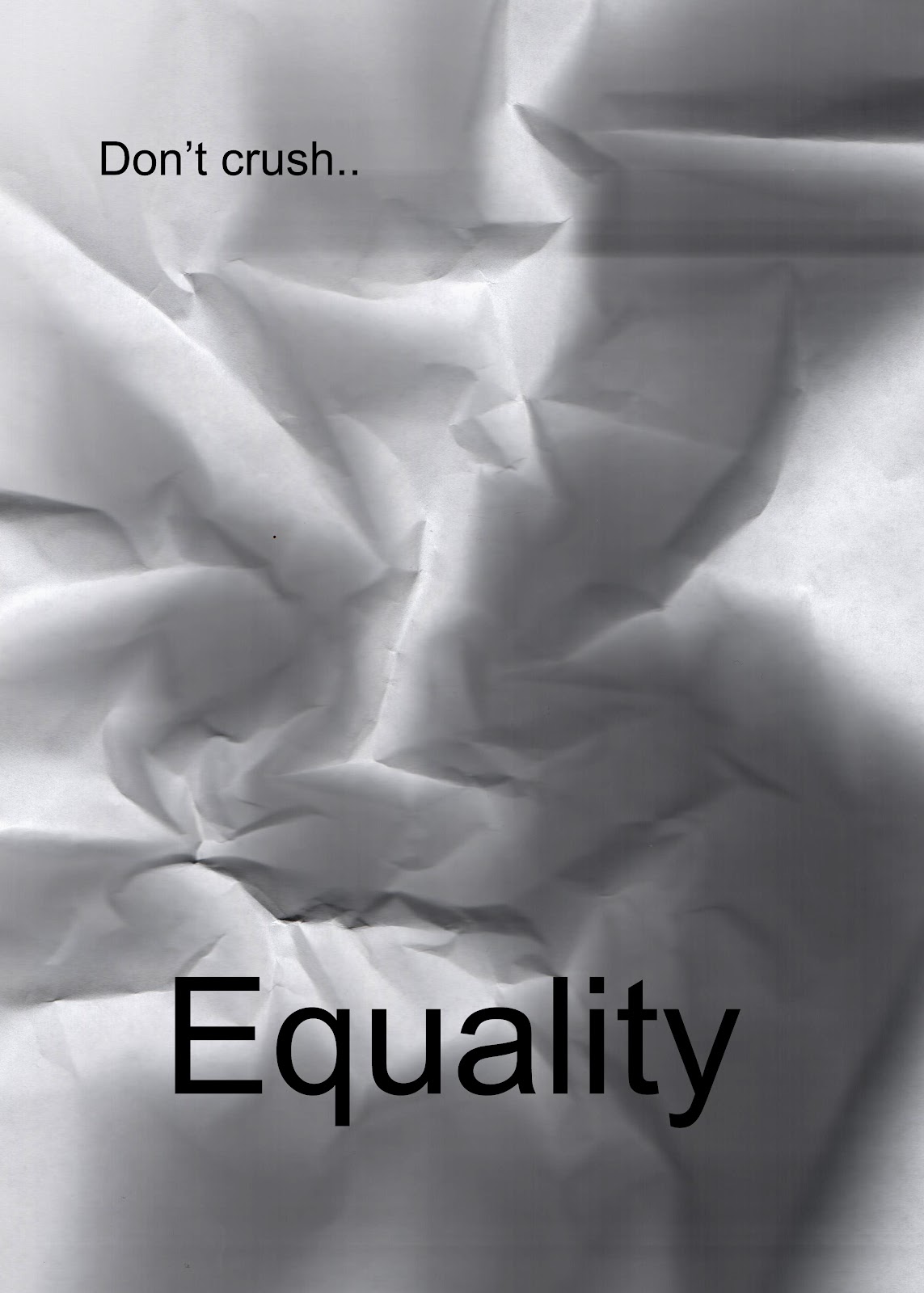
Think I prefer the crumpled one now that its portrait and takes up the whole page. I decided to go with the printed and crumpled version of equality rather than the Photoshop version. The typography just didn't look right on the Photoshop one (you can see it in the post below with development)
I'm happy with how the colour and type turned out on the wo man poster.


Development of the second poster


After some feedback i'm going to develop this poster below

I reprinted the word equality but done it portrait so the crumpled paper will fill the whole page
I opened it in Photoshop and changed the brightness and contrast.


Looks really good, but I realised that I've used a different font and I don't think it has as much impact as the last one so i'm now going to reprint it using the old font.


Original scan of the thinner font. Not as happy with the way the paper crumpled though.


I added "Don't crush..." And changed the brightness and contrast.
Still not happy. Think i might crumple up some plain paper, change the brightness and contrast and then add in the typography all in Photoshop.


Bit happier with this but i think the font needs to be smaller


..And i think that could be a final poster?

Poster Development


 After some feedback i'm going to take the poster above and develop it a bit.


I deleted the "Human Equality" and second "Man"
I want to split the word to make them look separate but leave it that you can still read "woman" and "man"

Just playing around with colour here


Definitely think the pink and blue looks better. Although the insides of the letter lose some of the texture. I just need to find the right layout now.


I like the idea of putting the letters on top of each other.

I duplicated the "W"  then flipped it and changed the colour. I think it looks better as the mirror image here.


Aligned the text to the left and enlarged it to fill the page a bit better.


Friday 27 April 2012

Best few posters

 These are the posters that I think turned out the best out of all my experiments...


Collage poster

After looking at David Carson i wanted to try a collage type piece. I found it difficult finding images that were gender mutual, but i picked these few to play around with.


I just played around with the colour and opacity and added the word Equality


I don't think this really worked so I used the same images (at the top) and these few below and started to experiment again.


In Photoshop I used the font "Impact" and cut out small sections of the images I had collected.
I then added some other text in plain black. i was trying to get across that you shouldn't see the difference in equality.

I like the layout here but don't think the message makes sense.


Scrumpled paper poster

I printed the word equality on an A4 page and then crumpled it up. I positioned it in different ways to see which gave the best effect


In Photoshop I cleaned up the edge of the page and also the edges of the letters because it had gone a bit blurry. I also changed the brightness and contrast to make the shadows stand out.


Thursday 26 April 2012

Stencil development

I scanned all my images of the stencils into Photoshop so I could work on them.


I used the lasso tool to go around all the letters because the stencil I had created got a bit messy.


I put each letter into a new document and then changed the brightness and contrast to make the letters stand out a bit more. 


Then I messed around with the layout and sizing of the words.


I think this one looks the best.


Messing around with filling the whole page here


Not sure if i like the couple above? Maybe a bit cluttered.