Monday 14 May 2012

Final Piece

So for the final piece i decided to just go with the idea that had the square around the type. And i started painting in the area which i showed in my last post.


I had a lot of bother painting on the brick because it was so bumpy, i kept having uncoloured patches where there was holes. It also made it hard to get a straight edge.


I thought i had finished but when i was looking at it i thought there was something not right. I then decided to paint the floor so it looked like a full square.

Finished Piece


From different angles


Sunday 13 May 2012

Final ideas?.. Maybe


Possible final piece idea?  I think the square one looks better but I'm just afraid that its not different enough from whats out there? I was influenced by things like overlapping and Varini for this idea. 
I'm not sure what to do now?.. Time for feedback.


The idea could be developed after this project and i could use it on my business card. It would need a few adjustments to tidy it up though, i made the lines thicker in this piece so it would look better when its painted on the wall and to make a clear distinction between the letters. I could also play around with the size of the smaller letters.


This is the space I'm going to use to do the final piece. At the bottom of this picture there is a large wooden box which i could position the typography over. I need to move all the stuff that's lying around the area before i begin.


Final piece development


In my sketchbook I have a few different ideas. I used Photoshop to develop them a bit.
This may look better using a different font, it seems very harsh and not really suitable for young kids.


This was my favorite idea (above) but I don't think its easy to read.


I like the positioning of the last one here, but I think maybe a different font would work better? and possibly using lowercase for the 'oyle' would look better.


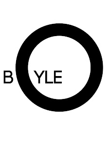
Messing around with my own name. I've decided i want to use my name/initials for the final piece instead, maybe in the future i could develop it into a logo for myself?
I really liked the flipped mirror idea (third from the top of this post) but it didn't turn out right. Below I've tried to incorporate the idea of overlapping the type and using the stroke effect like i did with the flipped mirror idea.


The use of the square here is influenced by Varini's work where he used the large circles around objects. It also helps give a bit of contrast and make it look a bit more interesting.


I was wondering what it would look like if i used the outline of the 'B'.. It does make it look more like typography but i think the contrast of the square would look better.

Fine tuning a bit here (below) I made the strokes bigger and changed the position of the 'oyle'



Tuesday 8 May 2012

Reflection


I like this (would cut down a bit of painting two) If i done BOYLE I would have problems with the Y and L. Also i would need to find a mirror that would be a suitable size.

Dual Meaning


I like this idea. It could work with the "Stay hungry, Stay foolish" I could overlap the words hungry and foolish. The only problem i have with it is that it may not be clear enough to read. Looking at this image i did have to squint a bit to figure out what it says.


This is nice two but don't think it would work as well with the anamorphic style.

Incorporating shapes


While researching mirror typography I found this image. I love how its got the square over the image, I'm wondering would this work with typography?.. Would it still be legible or would it just look like I've done it wrong? Could be something to experiment with.

Mirror images

Trying to find two words that would be made out of the one image. Not really coming up with anything good.